Graphic Design student at Noroff, who is passionate about art and design. This is my personal blog that will be reflecting all my work and thought processes throughout the course.
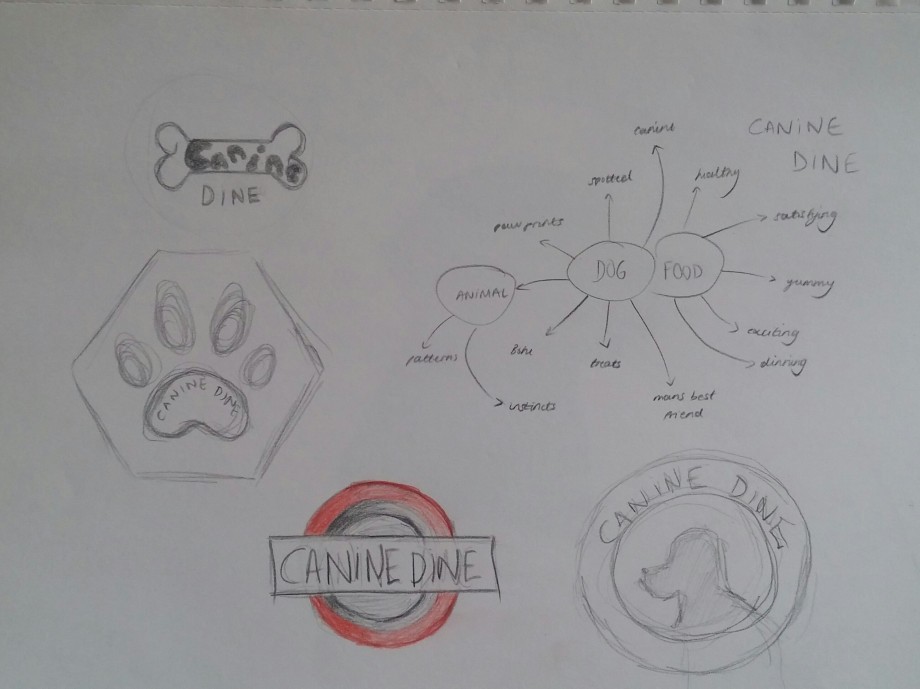
Here you can see my thought process, and thumbnails of possible logo designs.
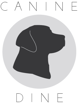
These are the three designs I decided to develop further:
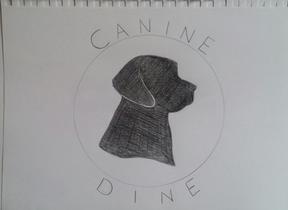
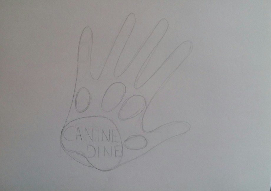
After asking for some feedback, I couldn’t decide, so I started developing two of my ideas further in Illustrator to get a better idea of what they would look like:
After hearing that the text of the second idea looked like animals droppings, I decided to stick to the first idea. Then I experimented with it further.
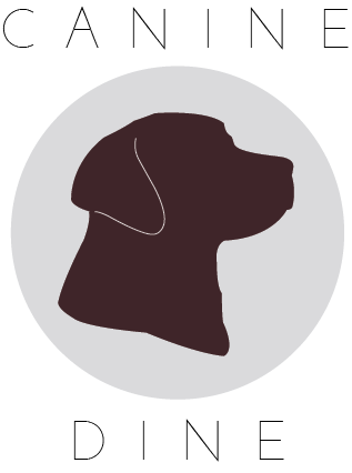
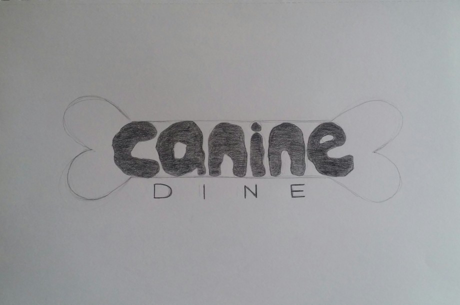
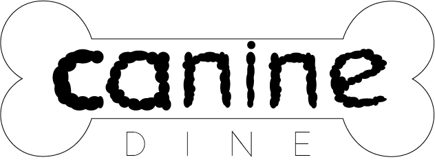
After getting some more feedback, I went with this design:
Apparently, it’s simple, timeless and memorable. I just hope it’s not too boring. I do like it though.
On an A4 landscape page, draw four equal squares. Create 4 more pages in this way. So, you’ll have 5 pages with four squares on each.
Draw one or two squares or rectangles in each empty square to achieve the following visual effects (refer to your textbook, p.41 as guidance). You can work with the interaction of rectangles and squares to make the balance or imbalance more evident.
Entering left
Movement to the right
Movement to the left
Movement downwards
Movement upwards
Balance
Tension
Symmetry/asymmetry
Balance because: Centred, mirrored shapes; Movement to the right because: Shapes stepping up to the right; Movement to the left because: Stepping up to the left; Movement upwards because: Stair illusion, pointing upwards.
Balance: This was the first thing that came to mind when I thought of balance.
Movement to the right: I thought of a step going up the the right.
Movement to the left: Same as above, but to the left.
Movement upwards: I thought of an arrow pointing upwards – it later reminded me of stairs.
Balance because: The weight is equal on both sides, centred; Movement to the right because: Shapes flow towards the right, arrow shape; Movement to the left because: shape is positioned to the left; Movement upwards because: shapes pointing upwards, eye follows the shapes upward.
Balance: I thought of balance of weight, and I wanted the white space to be divided equally.
Movement to the right: The shapes form an arrow pointing towards the right.
Movement to the left: The simple shape was placed to the left of the white space.
Movement upwards: Shapes pointing upward. The human eye seems to follow shapes from big to small.
Movement downwards because: flows downwards, eye follows large to small; Tension because: shapes positioned tightly together; Asymmetrical because: appears off-centre, shapes don’t mirror each other; Symmetrical because: mirrored shapes.
Movement downwards: A zigzag composition pointing downwards.
Tension: The shapes placed tightly together reminded me of a tense spring.
Asymmetrical: I wanted shapes that didn’t mirror each other to be centred, but appear to be otherwise. The centre is where the top left corner of the medium rectangle meets the larger rectangle.
Symmetrical: This is a typical mirroring of shapes. I wanted a noisy composition that would catch your eye.
Movement downwards because: shapes flow downwards, “dripping” illusion; Tension because: Many shapes pressed together, two “arrows” pointing towards each other, contradiction; Asymmetrical because: shapes don’t mirror each other; Symmetrical because: mirrored shapes.
Movement downwards: I thought of a melting icicle – the water drops flowing towards the tip before falling.
Tension: I thought of two arrows contradicting each other.
Asymmetrical: …I’m not sure how to explain this one… but it’s not symmetrical.
Symmetrical: These were simply two identical shapes, opposite each other, diving the white space equally on each side.
Symmetrical (1) because: mirrored, centred, corner to corner; Asymmetrical (1) because: organised chaos, don’t mirror each other; Asymmetrical (2) because: Don’t mirror each other, off-centre. Symmetrical (2) because: shapes flow from corner to corner, splits white space in two.
Symmetrical (1): I wanted shapes flowing from one corner to another. I also wanted some centred shapes, and “frame” shapes. I was making an “H” composition. I don’t know if it looks more like an “N” to some… But the point was that your eyes would interpret an “H” out of the composition.
Asymmetrical (1): This is what I would call organised chaos. The composition is not symmetrical but it looks tidy.
Asymmetrical (2): This was my “A” composition. It’s not centred, and it’s not symmetrical, but it catches ones eye… I think. (To be honest, sometimes I think asymmetrical things are more eye-catching that symmetrical things… though symmetrical things seem to be more satisfying to look at.)
Symmetrical (2): I wanted the white space to mirror the shapes. So the white space is rectangular, and equal in each corner, just as the shapes mirror each other.
We were given 4 riddles to solve to get our creative juices flowing. Here they are with my answers.
A man is replacing a wheel on his car, when he accidentally drops the four nuts used to hold the wheel on the car. They fall into a deep drain, irretrievably lost. A passing girl offers him a solution that enables him to drive home. What is it? Take a nut from each of the other three wheels. This will leave each wheel with three bolts – a temporary fix!Two Russians walk down a street in Moscow. One Russian is the father of the other Russian’s son. How are they related? The two Russians are husband and wife – and parents to said son.What occurs once in June, once in July and twice in August? U! As in the letter “u”, not you.Six drinking glasses stand in a row, with the first three full of water and the next three empty. By handling and moving only one glass at a time, how can you arrange the six glasses so that no full glass stands next to another full glass, and no empty glass stands next to another empty glass? What is the minimum number of moves to solve this puzzle? The minimum number of moves is two. Pour second glass of water into second empty glass; put the now empty glass back.