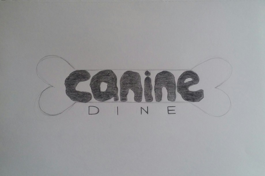
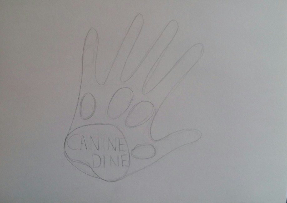
Here you can see my thought process, and thumbnails of possible logo designs.
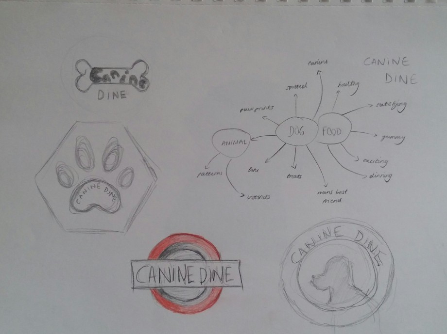
These are the three designs I decided to develop further:
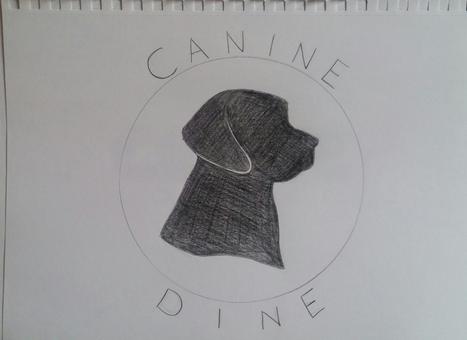
After asking for some feedback, I couldn’t decide, so I started developing two of my ideas further in Illustrator to get a better idea of what they would look like:
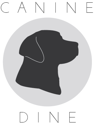
After hearing that the text of the second idea looked like animals droppings, I decided to stick to the first idea. Then I experimented with it further.


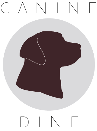
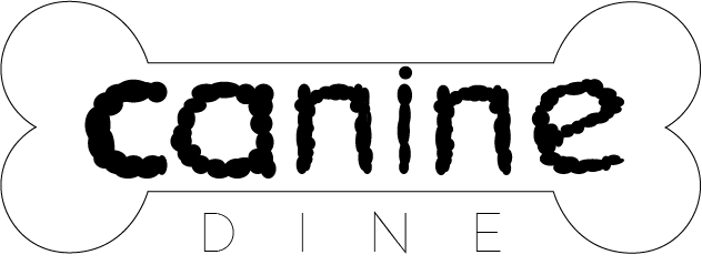
After getting some more feedback, I went with this design:
Apparently, it’s simple, timeless and memorable. I just hope it’s not too boring. I do like it though.


