Category: Learning Activity

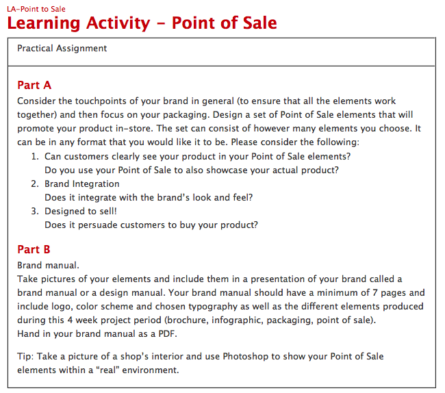
Learning Activity – Point of Sale

Screen Shot 2017-03-07 at 21.47.58

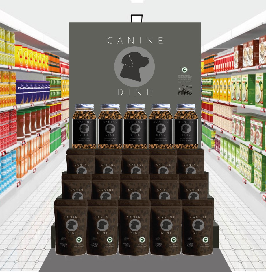
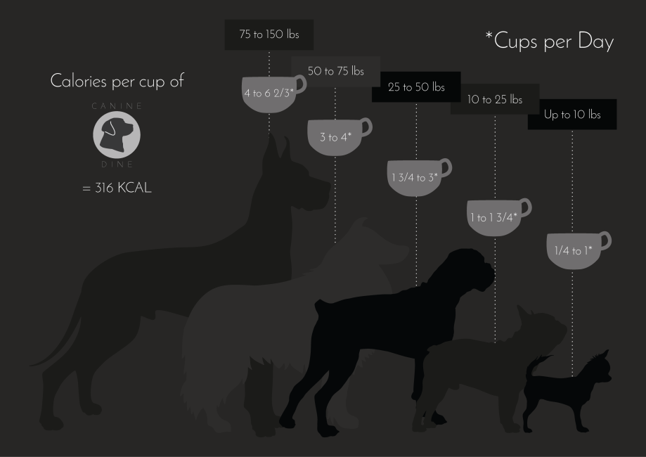
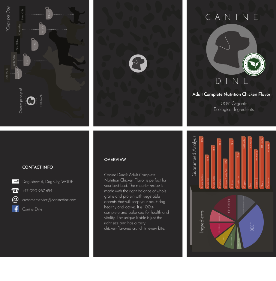
Display set:

point of sale  copy.jpg

Brand Manual:


I should, at this point, point out that I didn’t get to professionally print or take photos of my products. This was due to a mishap with the printers I used. They did a terrible job. After talking to my teachers about the matter, we agreed that I could make some mockups instead.

Learning Activity – Market Your Website

screen-shot-2016-12-19-at-11-56-15


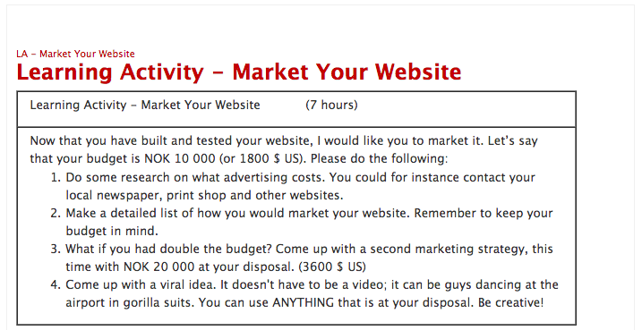
WAYS TO MARKET YOUR WEBSITE & HOW MUCH IT COSTS:

Search engine optimization – free but time consuming (unless you pay someone else to do it for a minimum of 5000 NOK a month…)

SEO is the process of increasing your website’s visibility in search engine’s organic results through optimizing your pages with the keyword phrases people are likely to search for. Think about it: when you search for something in Google, do you typically go beyond the first couple pages of results? Probably not, and neither will your potential customers.

Some popular ways to improve organic search results are through editing existing content, removing barriers to indexing activities of search engines (something we’ve been doing at Ciplex for a while and see this type of marketing as one of the highest return on investments) increasing the number of backlinks or inbound links (links your website receives from other webpages — which indicates the popularity or importance of your website).SEO can be a time-consuming process initially, but it’s an important step towards getting more traffic and grabbing a top spot in search engines for your main keyword phrases. If you haven’t already optimized your website for search engines, it might take several months to see significant results with SEO.

Blogging – free

 Pay per click (PPC) – flexible fee

You pay a fixed price for every click your ad gets in the search engine

Retargeting

Retargeting ads work by placing a tracking cookie on each of your visitor’s computers. Then, when they leave your site, they start seeing ads to come back.

Facebook ads – flexible fee

Facebook ads can help you target people from a specific location, friends of your current fans, or even folks who “like” other pages, among other options such as age and interests. It’s a cost-effective way to bring in new traffic — you can set a daily budget, pay for clicks, or pay when people see your ad.

Youtube

Creating videos and posting them to YouTube can help your content get found on YouTube itself. From there, not only does Google index your content, but others can embed your video on their blogs and share it via social media.

Focus on a call to action that tells viewers exactly where to go (your website), how to do it (link), and why to do it (free content, contest, etc.) once they’ve finished watching.

focus on a call to action that tells viewers exactly where to go (your website), how to do it (link), and why to do it (free content, contest, etc.) once they’ve finished watching.

 Email marketing – free

 Word of mouth (forums/Facebook fan pages etc.) – free

 Social Media – free

It’s a great tool for customer service inquiries and real-time communication when a crisis hits.

 PR

By serving as a source in journalist’s articles, the outlet typically provides a linkback to your website — which is usually great traffic that converts well, all while building your reputation. Plus, when you’re mentioned on a big press outlet — a trusted source for many people — they ultimately trust you more.


Newspaper ad – 128 NOK per day

 Stickers – 385 NOK per 100

 Flyers – 503 NOK per 1000

 Post Cards – 470 NOK per 500

 Roll-up Poster – 550 NOK per

 Posters – 350 NOK per 100


http://www.forbes.com/sites/ilyapozin/2012/04/11/10-proven-ways-to-market-your-website/#4a7d03f86913


BUDGET (1):                                                               10 000                         NOK

 52 DAYS OF ADDS IN NEWSPAPER:                               6 656               NOK

1100 FLYERS (100 PER TRAVEL AGENTS):                     530                  NOK

100 POSTERS:                                                                          350                  NOK

1000 POST CARDS:                                                                786                  NOK

1000 STICKERS:                                                                      1 669               NOK

 =                                                                                              9 991               NOK


 BUDGET (2):                                                                        20 000             NOK

 4 WEEKS OF BACKLIT DISPLAYS AT AN AIRPORT:     20 000 NOK

 Maximum exposure is worth the money. A backlit display at an airport, where hundreds of thousands of people come and go every day, is the best marketing you can do, in my opinion. The rest of the marketing would be free. I would use social media, blogging, and possibly PR.


VIRAL IDEA:

 If I had the budget for the prizes, I would create a competition.

What you have to do: like and share our Facebook page, and tag as many friends as possible.

How many prizes: 3

Prize 1: a two-week paid vacation in Provence.

Prize 2: two plane tickets to Marseille.

Prize 3: A coupon to save on a hotel in Provence.


As a follow up, I would travel to Provence with winners of prize 1, and a camera crew. And make a short film of the trip to advertise the website further on Youtube etc.


…Of course I would have to make a lot of improvements to the website before I could expect so much traffic!

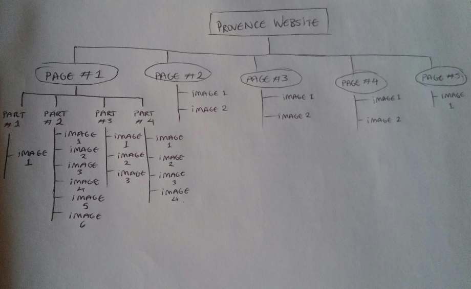
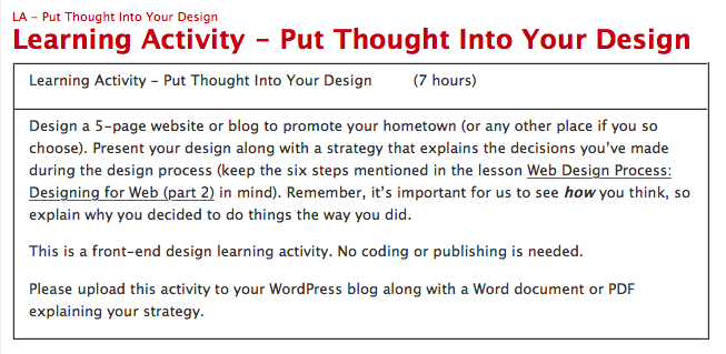
Put Thought Into Your Design


Screen Shot 2016-11-07 at 17.01.34.png

I chose to promote Provence, which although isn’t my hometown, is my  birthplace.

The first thing I have to say is that these pictures are not my own although I have manipulated most – if not all – of the photos, in one way or another.

Also, the text presented on the pages are copy and pasted from other sites, and may not correspond to the pictures. What I’m trying to say: Don’t see this design as a reliable source of information. The important thing about this assignment was Design strategy.

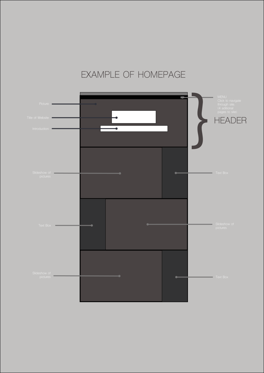
provence-wireframe-homepage

This slideshow requires JavaScript.


This slideshow requires JavaScript.

This slideshow requires JavaScript.

This slideshow requires JavaScript.

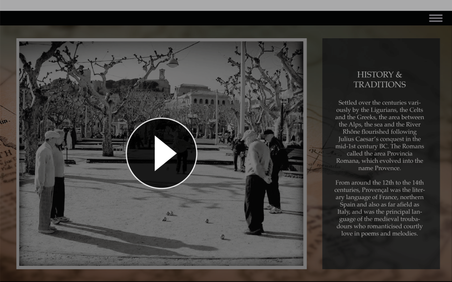
history-traditions

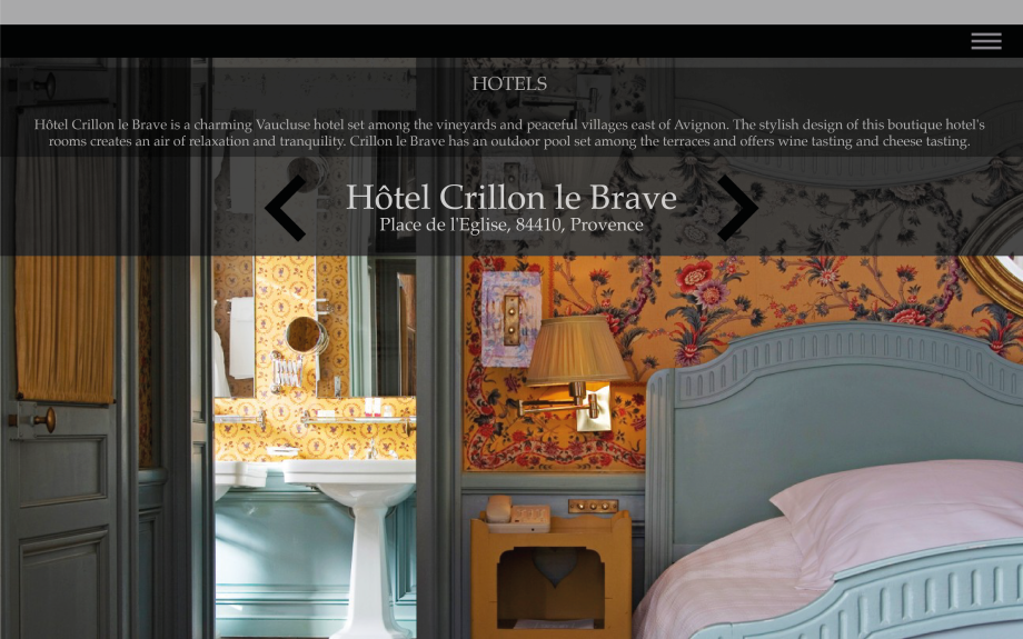
hotels

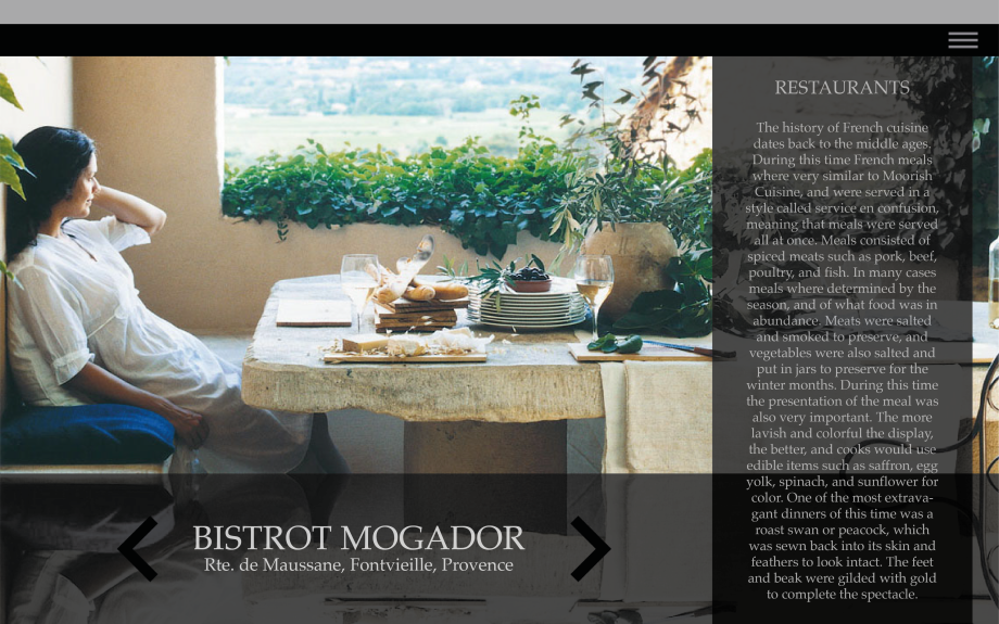
restaurants

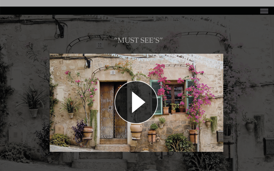
%22must-sees%22

Here’s the explanation of my strategy:

website-representing-provence

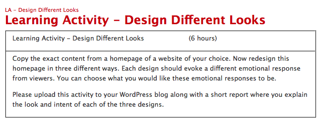
Design Different Looks


Screen Shot 2016-11-07 at 17.24.36.png

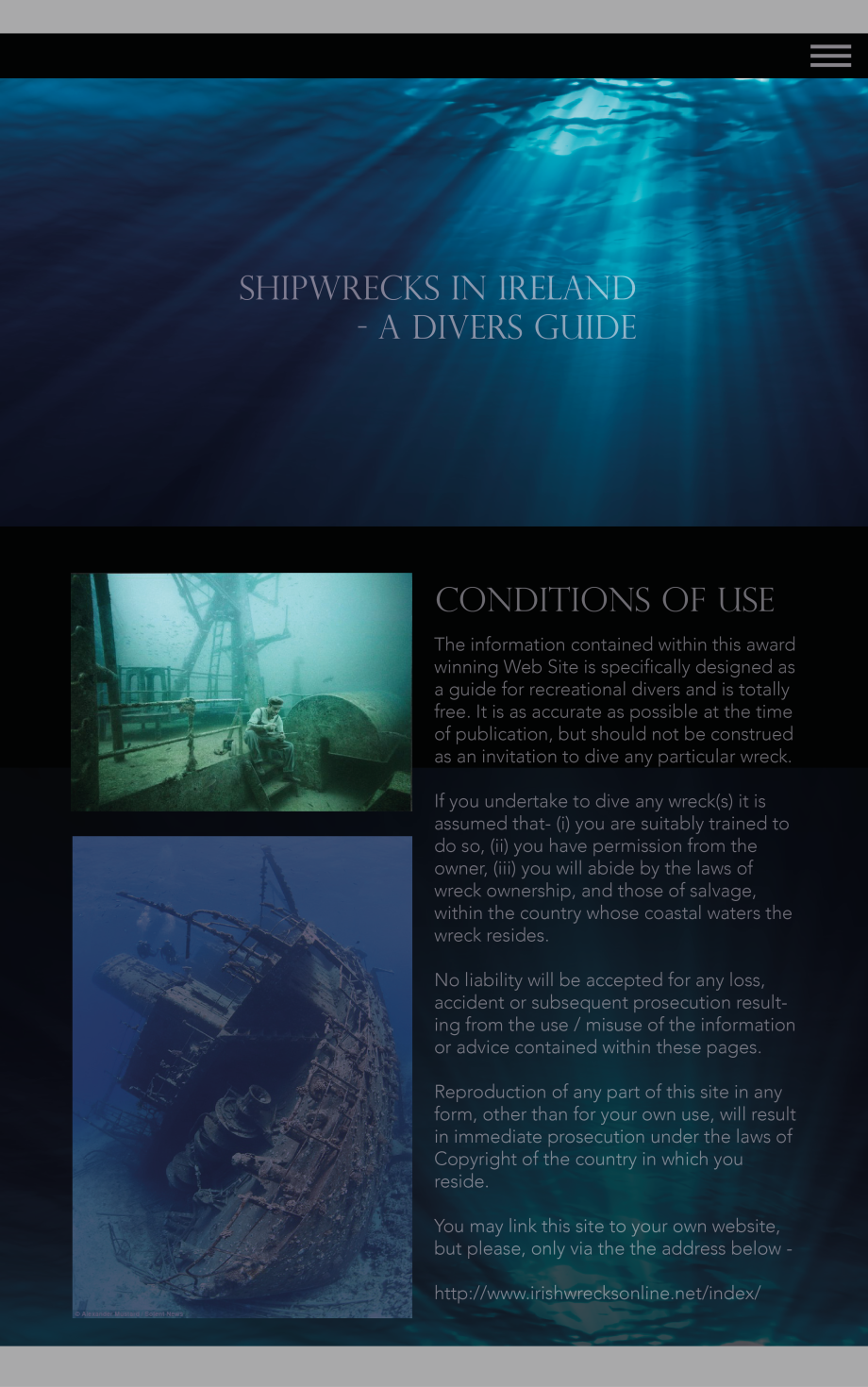
The site I decided to use is a site that I desperately would like to improve: http://irishwrecksonline.net

Screen Shot 2016-11-07 at 17.28.04.png


I don’t think I need to explain why…

Here are my three designs (I am aware that they are very similar, but I will try to explain how I think they’re different from each other):

DESIGN 1:

This slideshow requires JavaScript.

All of the following designs are simple, but this is the simplest one. A captivating underwater photo fills the entire page. There is a menu bar in the top right corner. I intend for this menu button to be of a hover function. The “Conditions of Use” page is the same, only with text. I didn’t feel the need to spread the text over the whole page. The original design is very simple and so with my first design I decided not to deviate too far from this concept.

Emotions: Curiosity

DESIGN 2:

This slideshow requires JavaScript.

I hope you can see these pages ok… Another simple design – as far as you can see. But the idea is this: The background is actually a calm video clip. Not much happens, but you’ll see fishes swimming by occasionally, and the rays of the sun seeping through the water. You’ll also be able to hear the sea, as if you were there. In this sense, the page becomes interactive.

Emotions: Serenity, curiosity

DESIGN 3:


shipwrecks-homepage-3

This design is slightly less simple. The picture next to the title: Conditions of Use, is intended to be an informative video. All information on one page makes this example of the site very simple.

Emotions: Curiosity, relaxed

Create a Wireframe


Screen Shot 2016-11-07 at 17.50.23.png

What kind of visitors are you expecting on your website?

I’m expecting the majority of visitors to be between the ages of 16 and 45, as our product is directed towards those age groups.


Who are your competitors and how do you differ from them?

*so and so no.1* and *so and so no.2*. They do not concern themselves with eco friendly solutions, only with quality; whereas, we concern ourselves with both areas equally.


Please list the names of three sites that you like and explain what you like about them.

I like *example no.1* because it’s simple but very informative – I like that they use photo’s to communicate their message more than text. I like the aesthetic of *example no.2* – it’s modern but has a timeless feel about it. *example no.3* really appeals to me because it’s so easy to navigate through the site.


Do you have any color preferences? What should the look and feel for the website be?

I would like there to be as few colors as possible, to make room for photos. White, grays, and perhaps dark blue (I think they fit with the logo). I would like the website to look timeless – modern but classy.


Who will be the contact person for this project?

*so and so no.4* will be happy to give you any feeback, or answer any of your questions.


What do you NOT want on your site in terms of text, content, color and graphic elements?

I am open to most things – I’m no expert when it comes to design. I cannot think of anything I absolutely do not want, but refer to *so and so no.4* if you’re unsure.


What are the businesses’ values and how do you usually convey these to your visitors?

As said previously, we value eco friendly solutions while always providing the best quality products. We often convey these things with slogans and special campaigns where we document our cooperation with eco friendly organizations.


Do you have a logo that you would like to use? Original artwork?

Yes I do. *so and so no.4* will send them to you via a OneDrive link.


Do you have full rights to the photos that will be used?

I think so, but I will get *so and so no.4* to double check for you.

Can you produce high resolution files for me?

Absolutely!

Wireframe Homepage details.png

Wireframe Add Page details.png


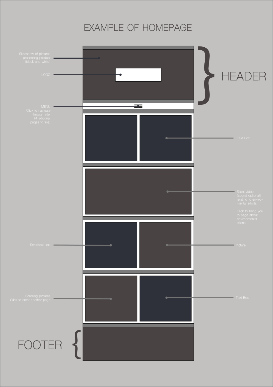
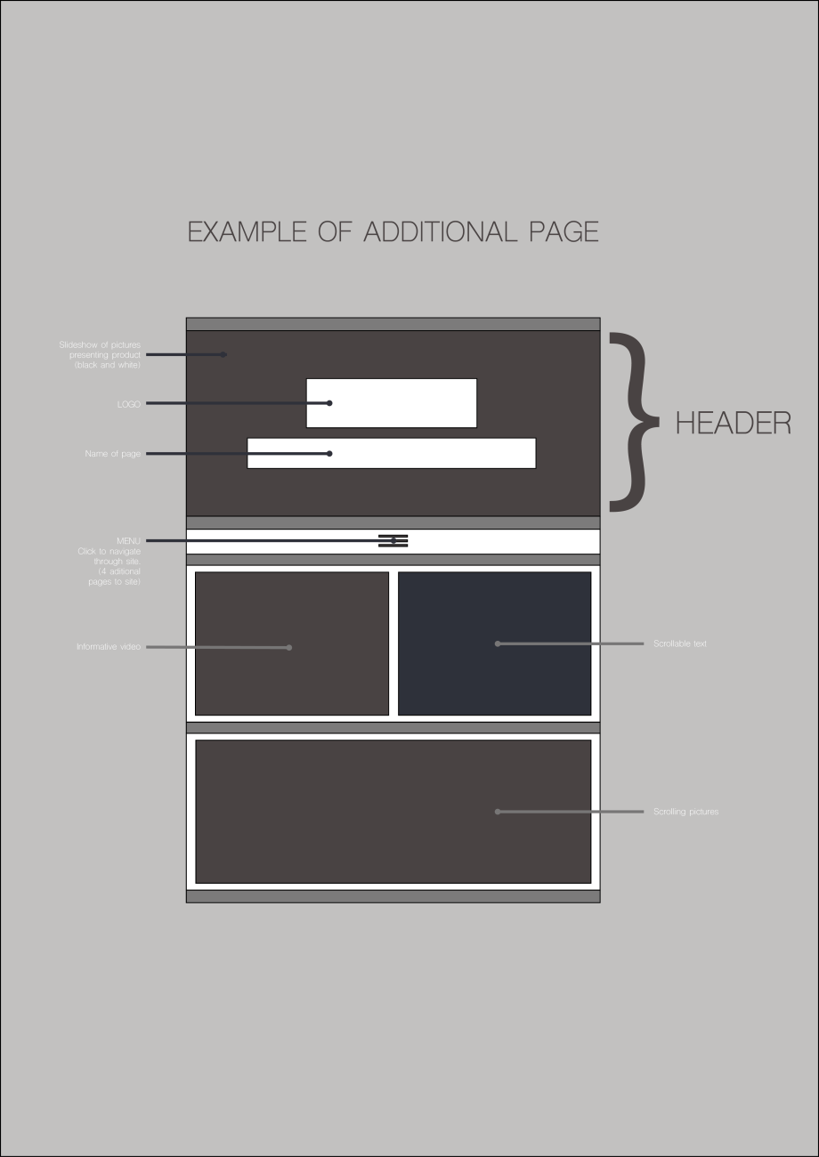
I chose to make a “high tech” wireframe. My reasons being that I personally feel that it’s more practicle and I work faster in illustrator than I do with pen and paper. It also produces a cleaner look.

Get the Basics Right

A little late, but here’s the first Learning Activity for the Web Design part of this course:
 

Screen Shot 2016-11-07 at 17.54.45.png

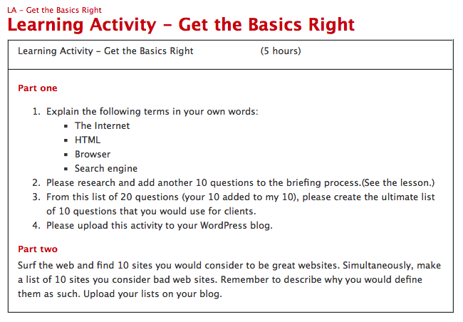
PART ONE


1.

The Internet = The Internet is a worldwide network of computers – that is, any device that connects to the Internet such as: mobile phones, tablets, personal computers etc. The Internet is all about sharing information.

HTML = This is the universal language that is used to share information through the Internet.

Browser = You need a browser in order to view HTML.

Search Engine = This is a programme that looks for keywords in HTML documents and gives the best/most popular result.


2 & 3

(10 existing questions:)

What kind of visitors are you expecting on your website?

Who are your competitors and how do you differ from them?

What actions do you want visitors to take on the site?

What is your deadline for completing the site? How big is the budget?

What features should be used on your website? (This includes things like contact forms, pictures, videos, etc.)

Please list the names of three sites that you like and explain what you like about them.

Do you have any colour preferences? What should the look and feel for the website be?

Who will be the contact person for this project?

What do you NOT want on your site in terms of text, content, colour and graphic elements?

Who will be responsible for maintaining the website? Will the person have the time and skills to do so?


(My 10 extra questions:)

What will be the purpose of the website?

What are the businesses’ values and how do you usually convey these to your visitors?

Do you already have a URL that you plan on using?

Do you have a logo that you would like to use? Original artwork?

Do you have full rights to the photos that will be used?

Can you produce high resolution files for me?

Do you need any password protected/ membership only areas?

What do you like least/most about your current website?

Will you need a search engine integrated in your website?

Will you be running adds on your website?


(Questions in bold are response to task 3)


PART TWO


Websites I consider to be bad:

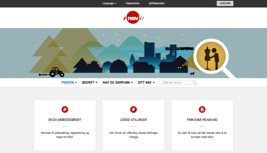
(Fortunately I don’t come across many badly designed websites, so I had to search for “badly designed websites” and found most in that way. Nav.no is the only exception.)
Screen Shot 2016-11-07 at 18.00.24.png


Nav.no

Nav stands for “Nye arbeids- og velferdsetaten” which is the Labour and Welfare Administration. As you can imagine, this is a website with a lot of information. However, I have always struggled to find the information I need – ALWAYS. I understand that it must be difficult to design such a vast website – and you can clearly see what the designers have tried to accomplish. (I feel slightly unqualified to make these comments seeing as I’m just starting out myself) I’ll give it to them; they’ve tried. But there are many things that they could make better. I often give up and have to google for the information I need. Then google will often direct me to a page from the nav website – that I wouldn’t otherwise be able to find. It’s not user-friendly at all (even though they’ve tried to make it look like it is) and very frustrating to use.
Screen Shot 2016-11-07 at 18.00.51.png


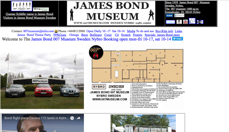
007museum.com

This website does not live up to what it’s representing at all. It represents the brand James Bond very poorly – and the design generally is also very poor.
Screen Shot 2016-11-07 at 18.01.11.png


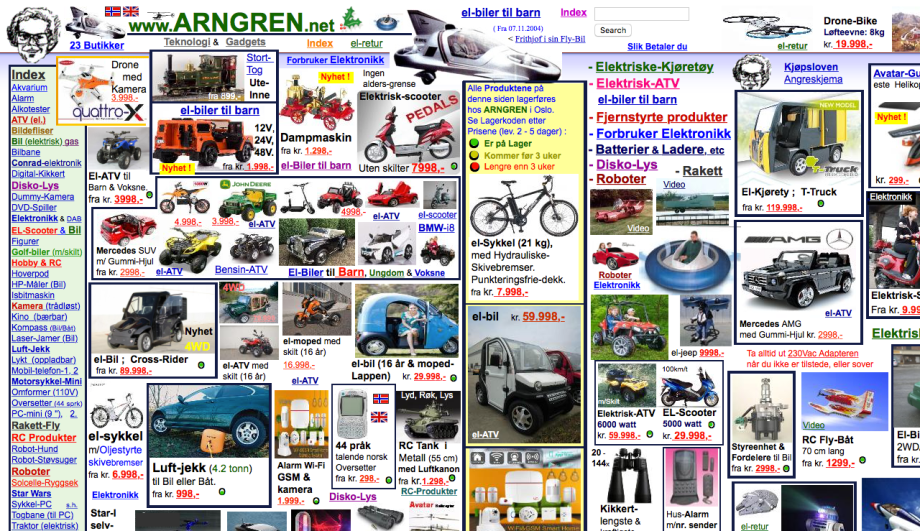
arngren.net

This is one of the messiest sites I have ever come across. In this case, they have not kept it simple. It’s not user friendly because it’s frustrating to navigate through it and it’s not pleasing to the eyes…
Screen Shot 2016-11-07 at 18.01.43.png


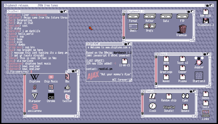
chiptune.com

At first glance, I kind of liked this… but it’s not user friendly at all. I see what the designer tried to do, but it’s not working. I have no idea what I’m looking at, or what I’m supposed to look for.
Screen Shot 2016-11-07 at 18.02.21.png


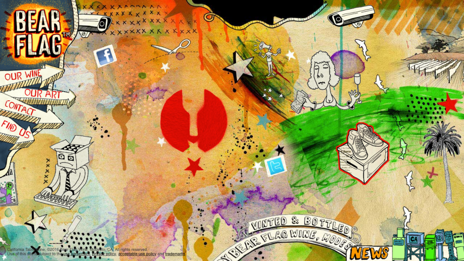
bearflagwine.com

I love the illustrations, but not here. They serve little to no purpose. If you don’t need it, lose it. It took me a while to figure out where I should click…
Screen Shot 2016-11-07 at 17.28.04.png


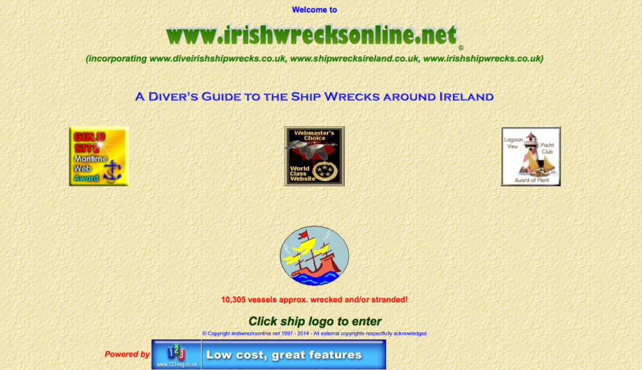
irishwrecksonline.net

Diving to the depths of ship wrecks spells mystery and adventure (among other things)– and this poor excuse for a website does not convey those things in the slightest! An extremely disappointing website.
Screen Shot 2016-11-07 at 18.03.33.png


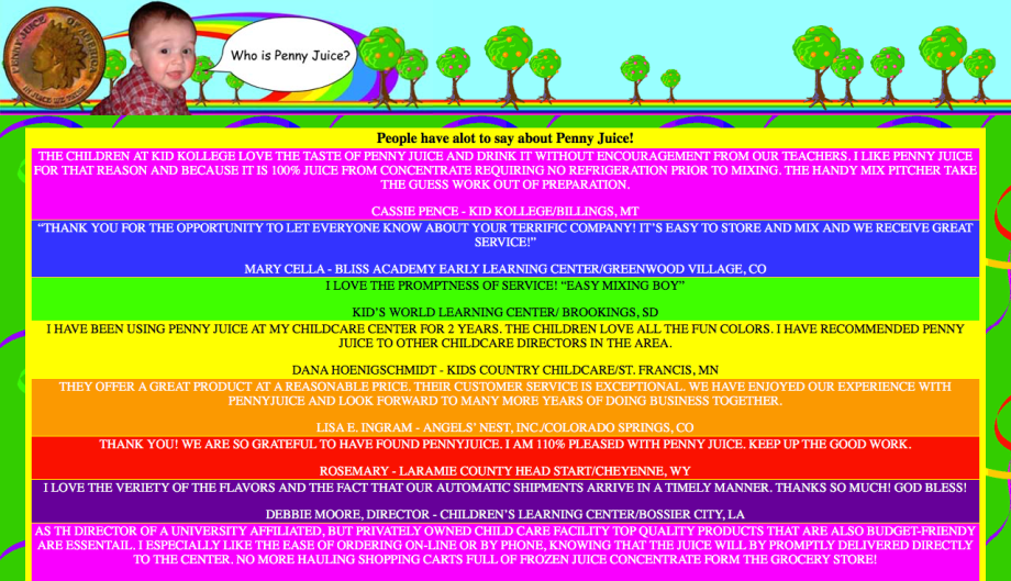
pennyjuice.com

I know that this website is representing juice for children… so I understand why they’ve used so many colors. They’ve also used different colors to represent different flavors of juice. But this does not look professional at all, and it’s enough color to give you a headache. Also, Comic Sans is a very unprofessional font to use in any way, on any website.
Screen Shot 2016-11-07 at 18.04.14.png


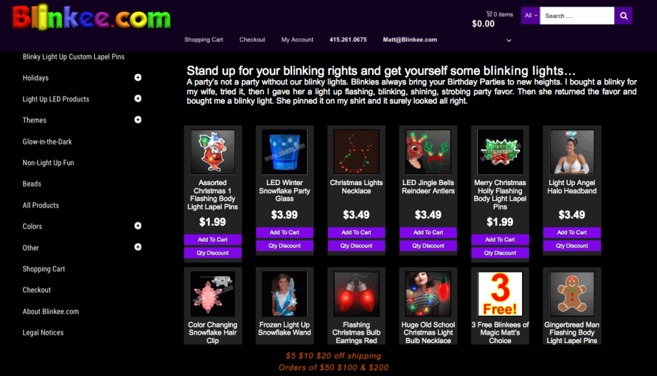
blinkee.com

This website is selling sparkly, glow-in-the-dark products. And they convey this aspect very well. But there’s too many colors, for starters… Secondly the icons are so small – it doesn’t matter how much you make them blink at me – I can’t see the products. Which is strange, because it doesn’t look like they’ve used the whole page properly. They’ve just crammed everything to the left.

(this website has been slightly improved since I first wrote this post)
Screen Shot 2016-11-07 at 18.05.10.png


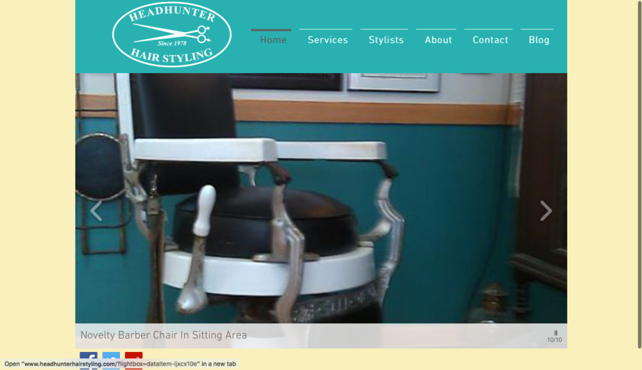
headhunterhairstyling.com

At first glance, this website didn’t do so bad. But then I noticed the pictures (both on the homescreen and the Stylist section) and a lot of them seem to be taken from the internet, and the ones that weren’t were really really bad quality.
Screen Shot 2016-11-07 at 18.06.23.png


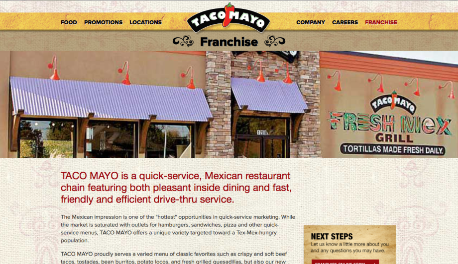
tacomayo.com

Taco Mayo’s website also struggled with producing good quality photos. Although I can’t fault them on all of the photos used.


Websites I consider to be good:
Screen Shot 2016-11-07 at 18.10.55.png


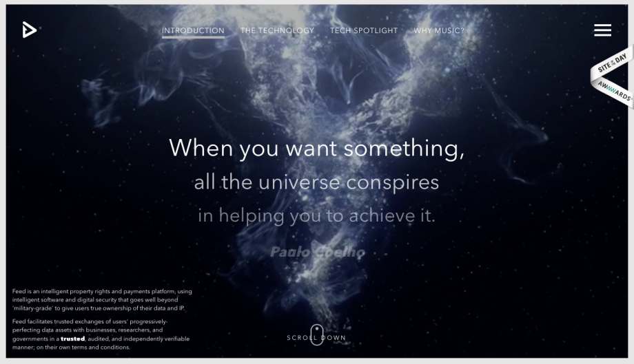
feedmusic.com

This website has a brilliant design that gives the ultimate HD experience. I think it’s pretty easy to navigate, and it moves from slide to slide smoothly.
Screen Shot 2016-11-07 at 18.11.25.png


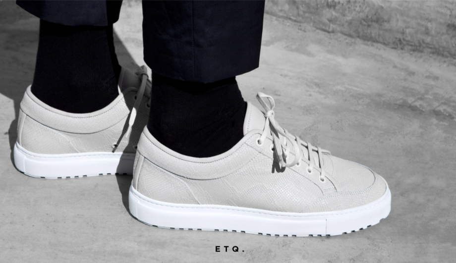
etq-amsterdam.com

I love how simple and minimalistic this site looks. It’s very pleasing to the eyes, and it’s one long scroll. If there’s something I really dislike on shopping websites is the “next” button. Especially when there are 100’s of pages to click through. I much prefer this solution.
Screen Shot 2016-11-07 at 18.12.11.png


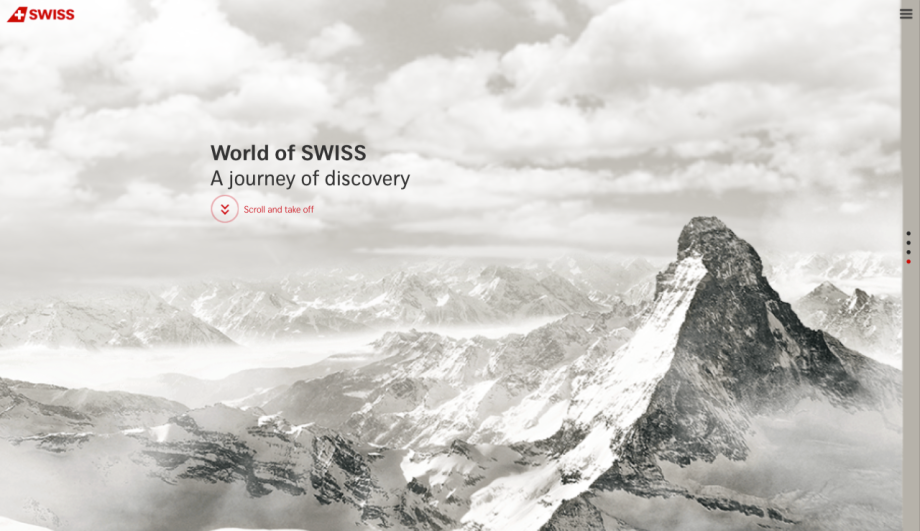
world-of-swiss.com

This is a nice and simple site. It represents the brand fantastically – good color scheme.
Screen Shot 2016-11-07 at 18.12.30.png


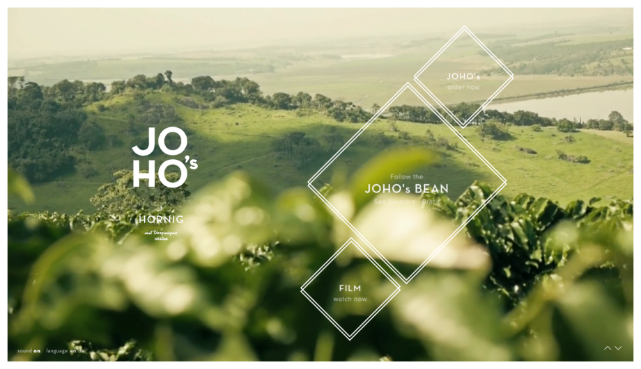
johos.at

The designers of this site have done a fantastic job at using HD photos and film. Even when zoomed in the photos do not become pixilated at all. I like the organic theme going on, and the colors. It’s very easy to navigate too, as the design is simple.
Screen Shot 2016-11-07 at 18.12.51.png


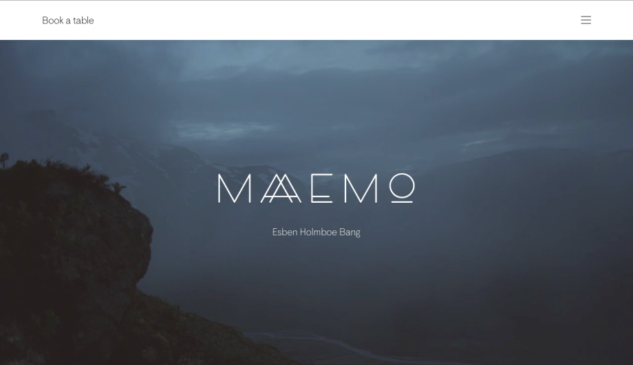
maaemo.no

This is one of my favorites because of its rawness. Black and white, with beautiful landscape films at the top of the page. Again, a site that just scrolls all the way through.
Screen Shot 2016-11-07 at 18.13.17.png


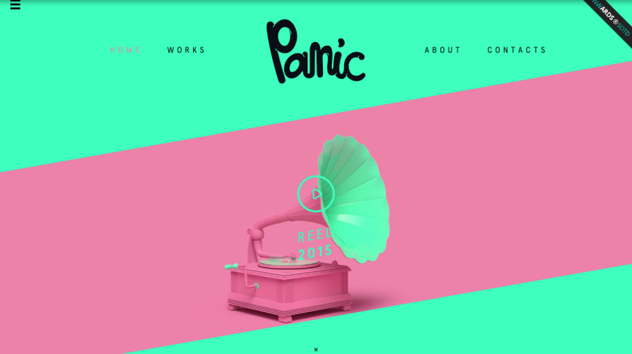
panic.lv

I love everything about this site – the color scheme, the fonts, the logo. It’s a fun-looking site and easy to navigate through it.
Screen Shot 2016-11-07 at 18.14.17.png


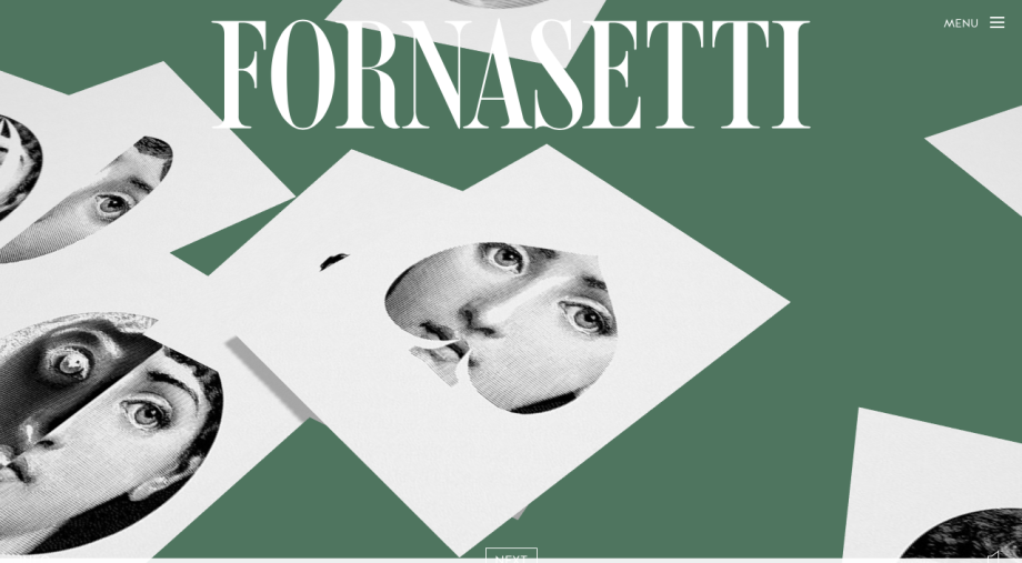
fornasetti.com

This is a classy website with good use of color, fonts, and graphics. The navigation is nice and smooth and they take you on a nice journey through their history.
Screen Shot 2016-11-07 at 18.15.10.png


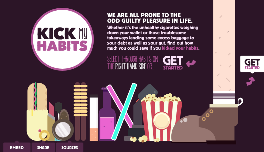
leedsbuildingsociety.co.uk/resources/kick-my-habits/

This website fulfills its purpose very well and has a nice funky design. The color scheme fits well, and it’s not too much. It’s very interactive and easy to navigate through.
Screen Shot 2016-11-07 at 18.15.36.png


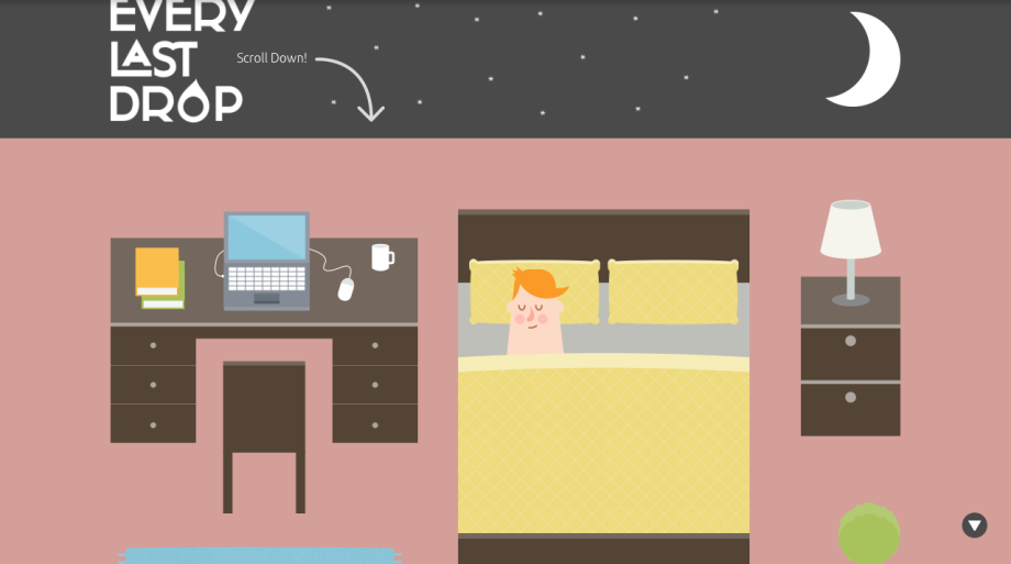
everylastdrop.co.uk

Here’s another scroll-all-the-way-down site! Interactive enough and fun animations get the point across. It serves its purpose well and will engage the average viewer.
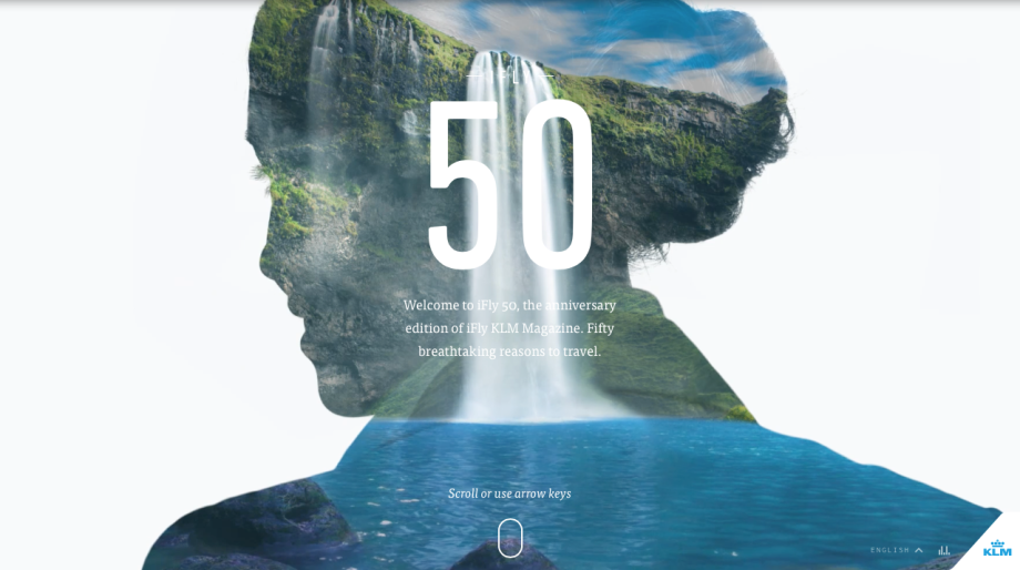
Screen Shot 2016-11-07 at 18.15.59.png


ifly50.com

The clever and simple design of this site had me engaged immediately. It may be because I love to travel, but they had beautiful high resolution photos, as little text as possible… and it was just really easy to navigate through.